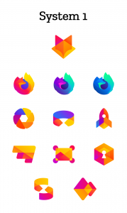
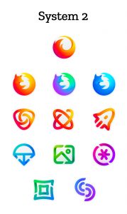
Firefox presents us with 2 proposals for visual systems. Which do you think would work best for the brand?
Mozilla is redesigning the Firefox logo but this time with the help of users, however the plan is not just to create a new icon for the browser, but to design a whole series of icons to fit different brand initiatives, from mobile and VR browsers, to screenshot and file sharing tools. Mozilla has already uploaded some possible takes, and now they want users to participate in their blog to get feedback on what the icons should look like.
Font: https://blog.mozilla.org/opendesign/evolving-the-firefox-brand/
![]()


